
0
Completed
Provisions in Last Month graph should be bar chart instead of line chart
Shane Day (Chief Technology Officer) 8 years ago
in UNIFYBroker/Plus
•
updated by Matthew Davis (Technical Product Manager) 6 years ago •
2
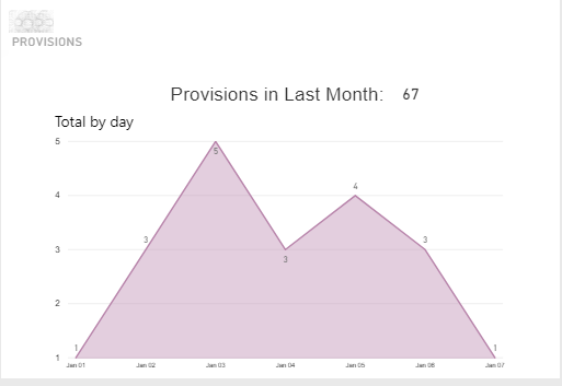
This graph is confusing - if it's the "last month" - where's the last month? I also think it would be better as a bar graph.
Answer


Answer
Completed
Graphs for IDaaS will be reviewed and redesigned with the pending migration to the new UNIFYMonitor.
Customer support service by UserEcho

Graphs for IDaaS will be reviewed and redesigned with the pending migration to the new UNIFYMonitor.